|
AIR QUALITY MATTERS |
|
Dorset |
|
|
|
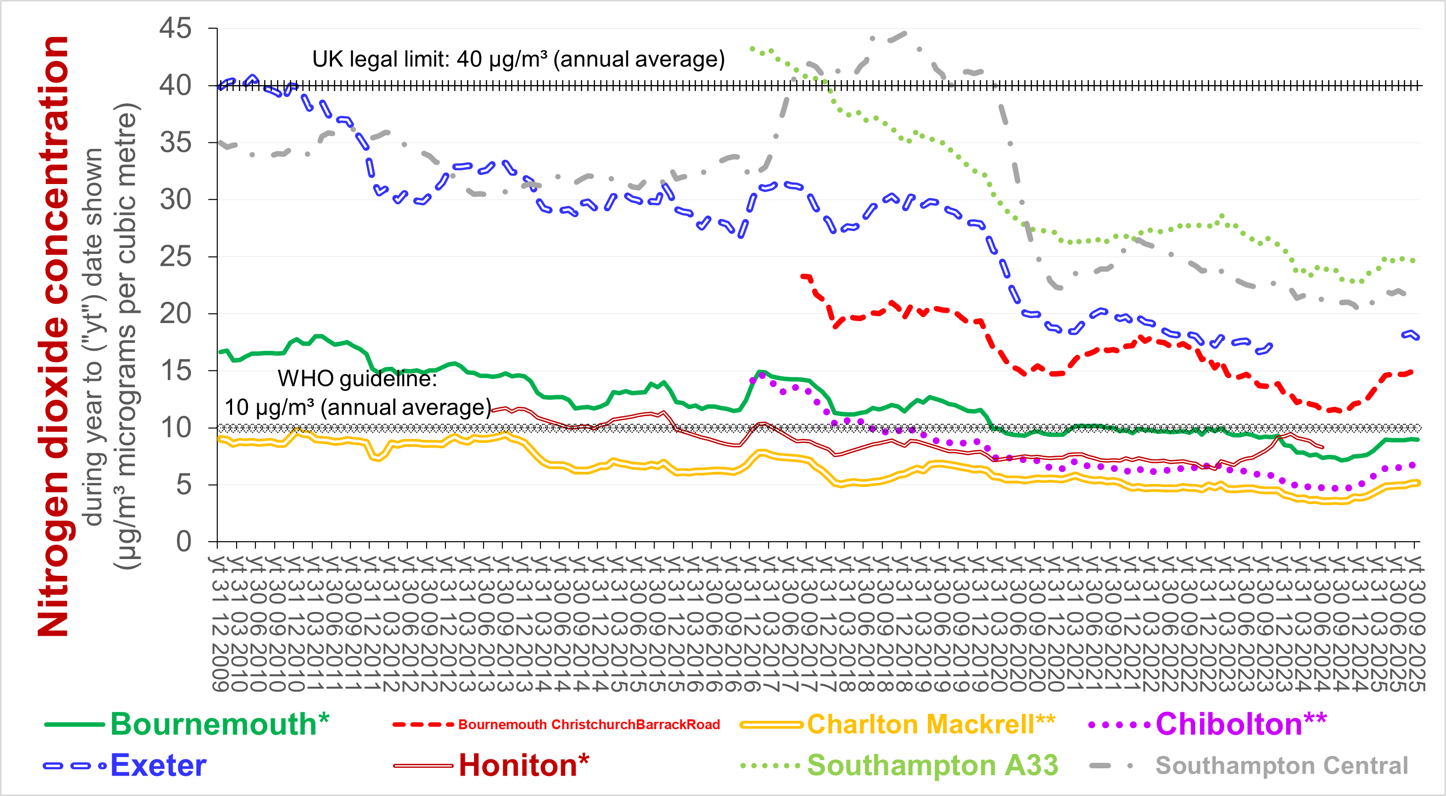
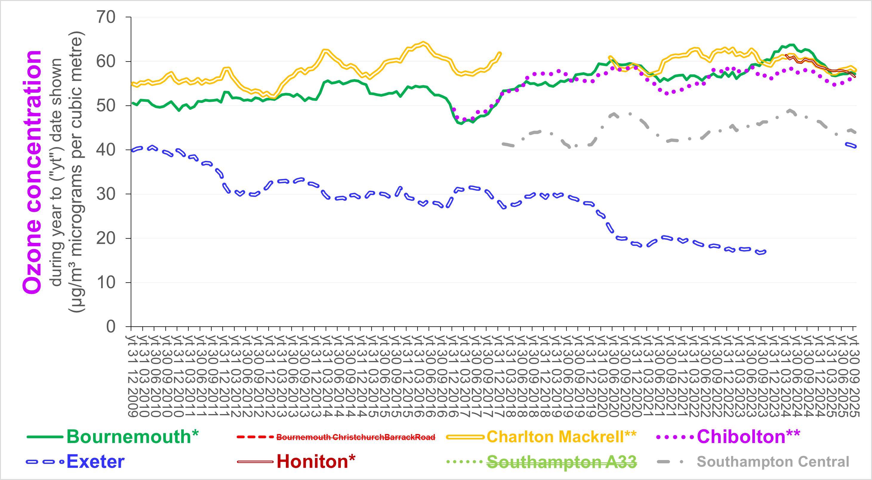
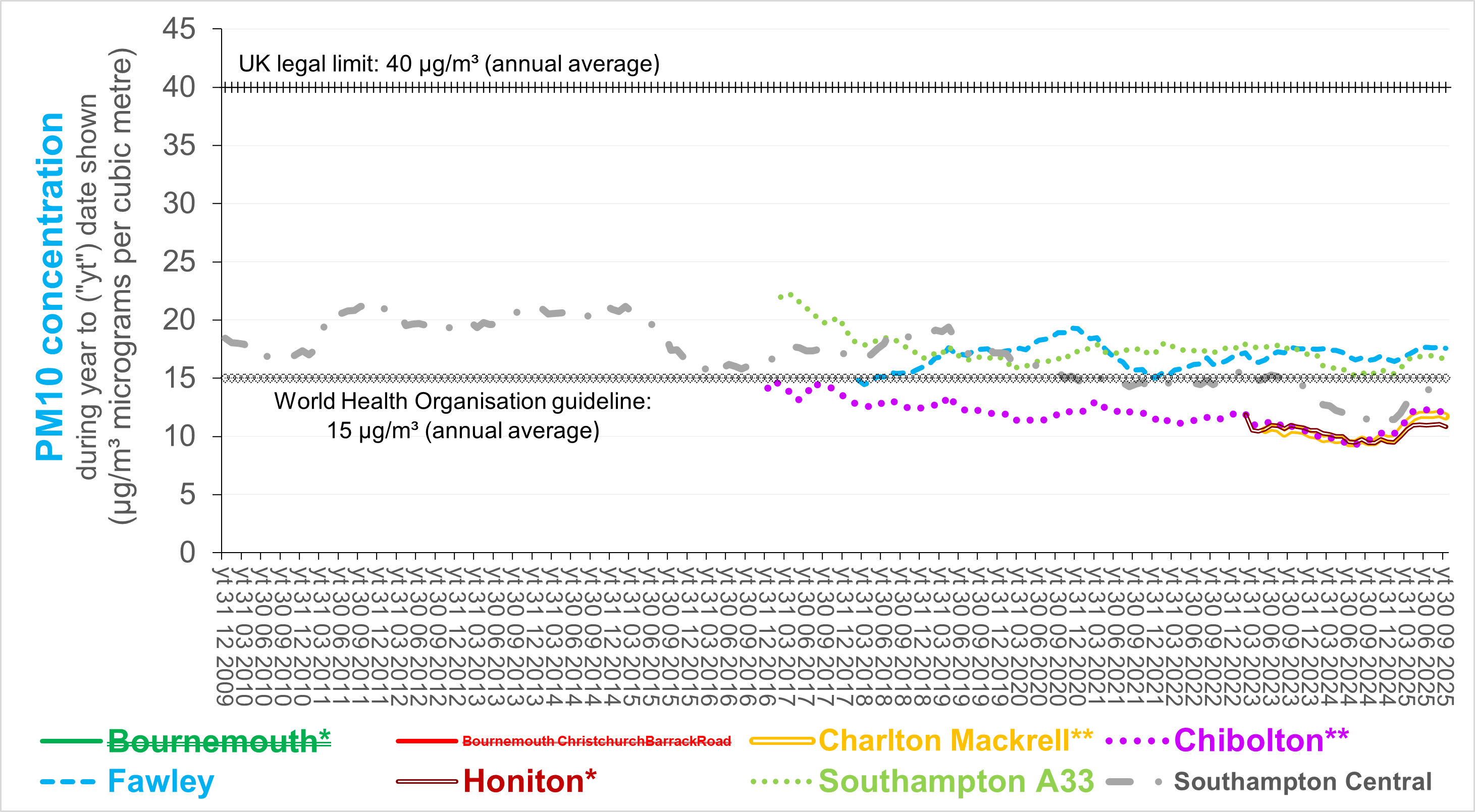
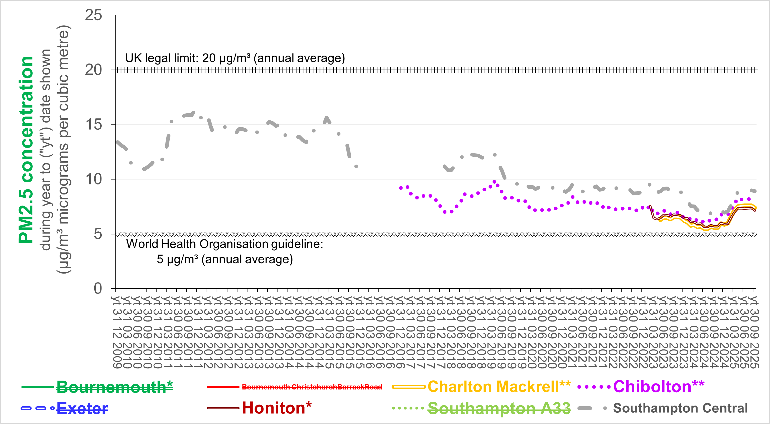
The following four charts show how the annual average
concentration of nitrogen dioxide (NO2),
ozone (O3), PM10 and PM2.5 have changed since 2009 at AURN reference stations
in Dorset and neighburing areas. The current trends are unclear but
probably downwards. If the number (also shape and
chemical composition) of particles per unit of volume determines
health impact, then trends in weight per unit of volume might be
misleading.
Source (for
the four charts above): based on
airqualityengland.co.uk
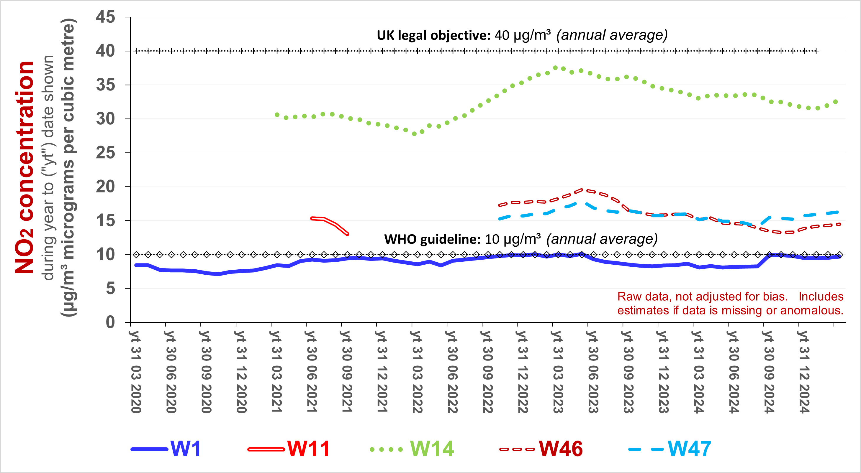
The
following charts illustrate trends in average
concentrations of NO2 in consecutive periods of 12 months - raw,
without adjusting for bias - as measured
using diffusion tubes around the
county.
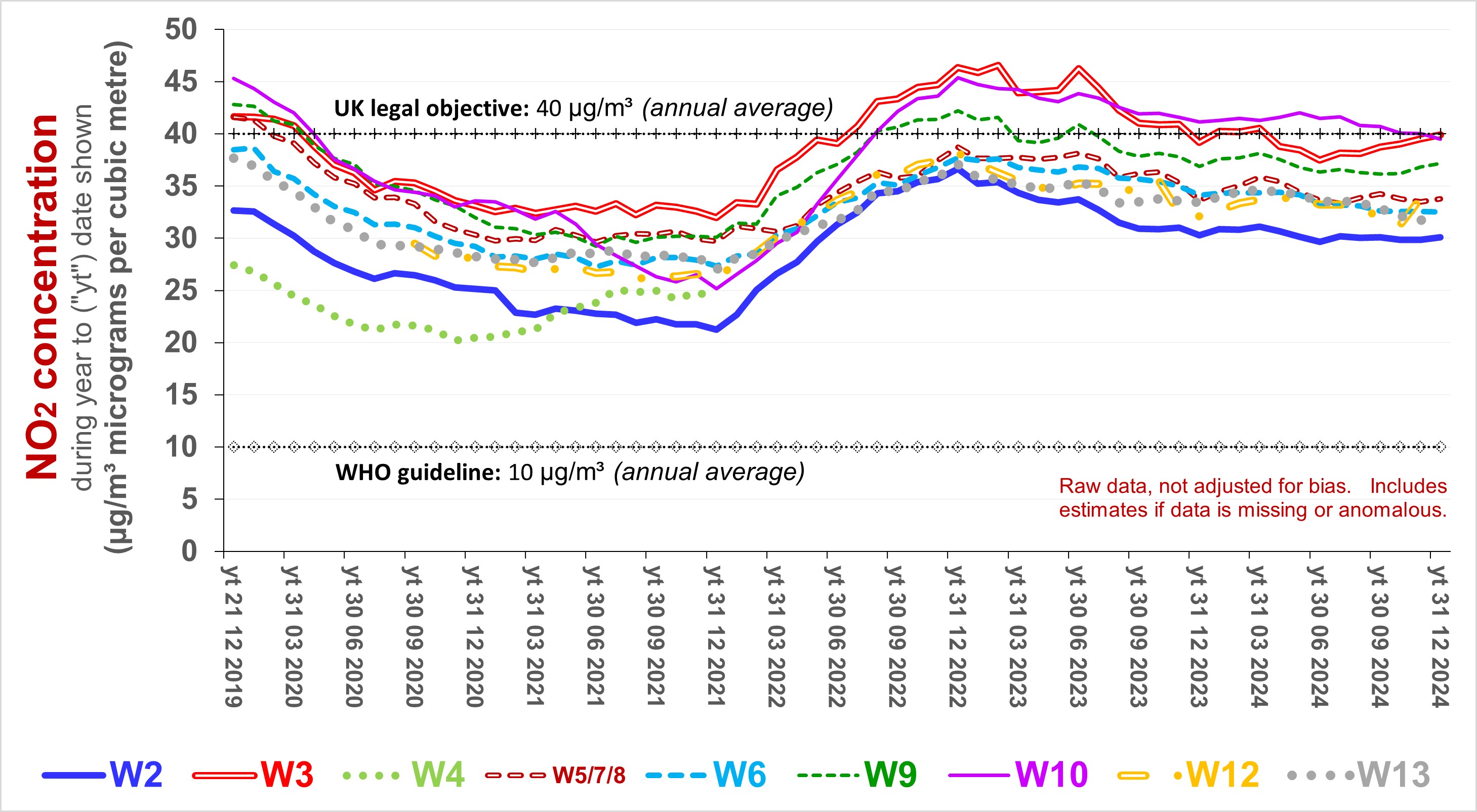 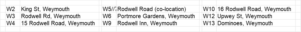
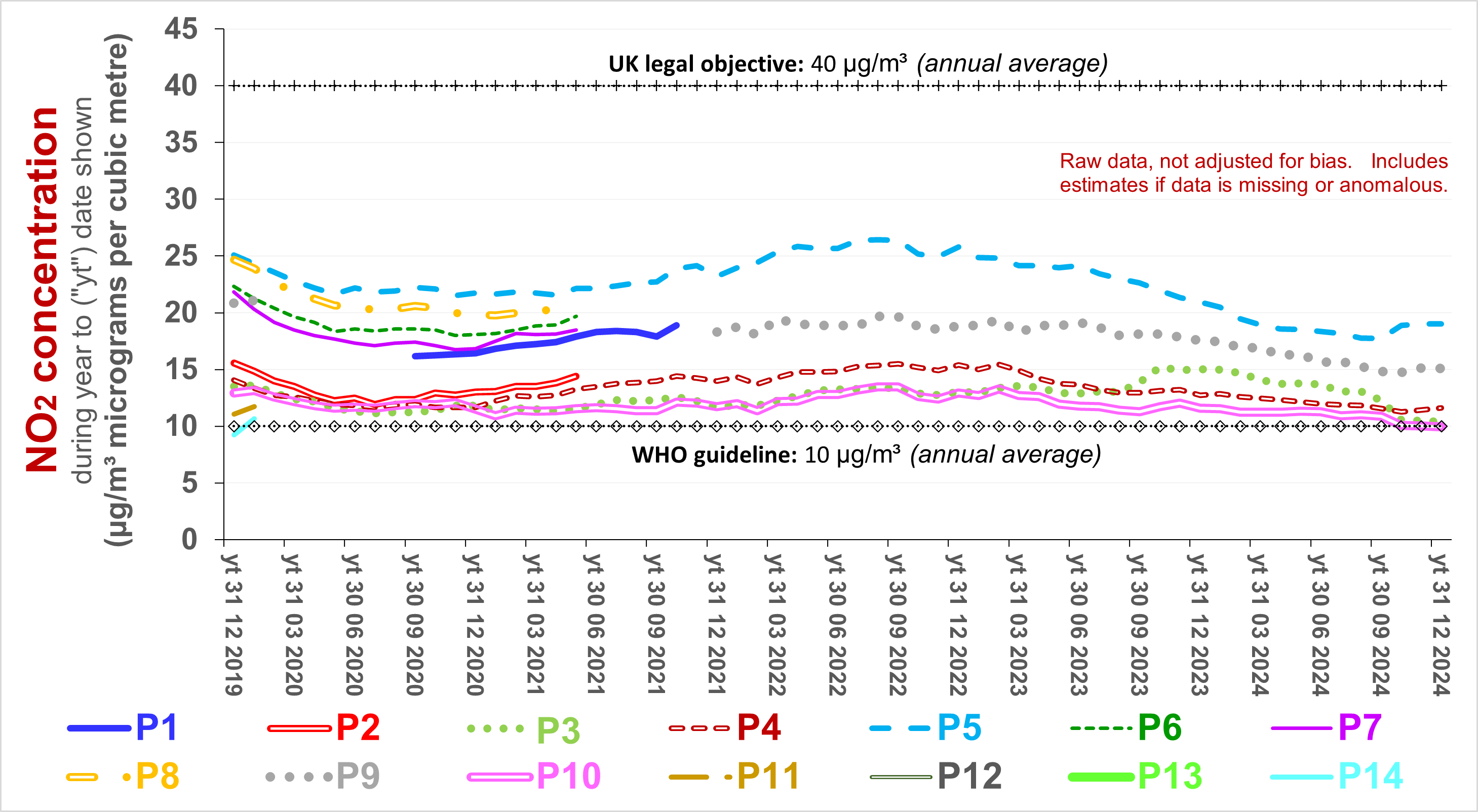 
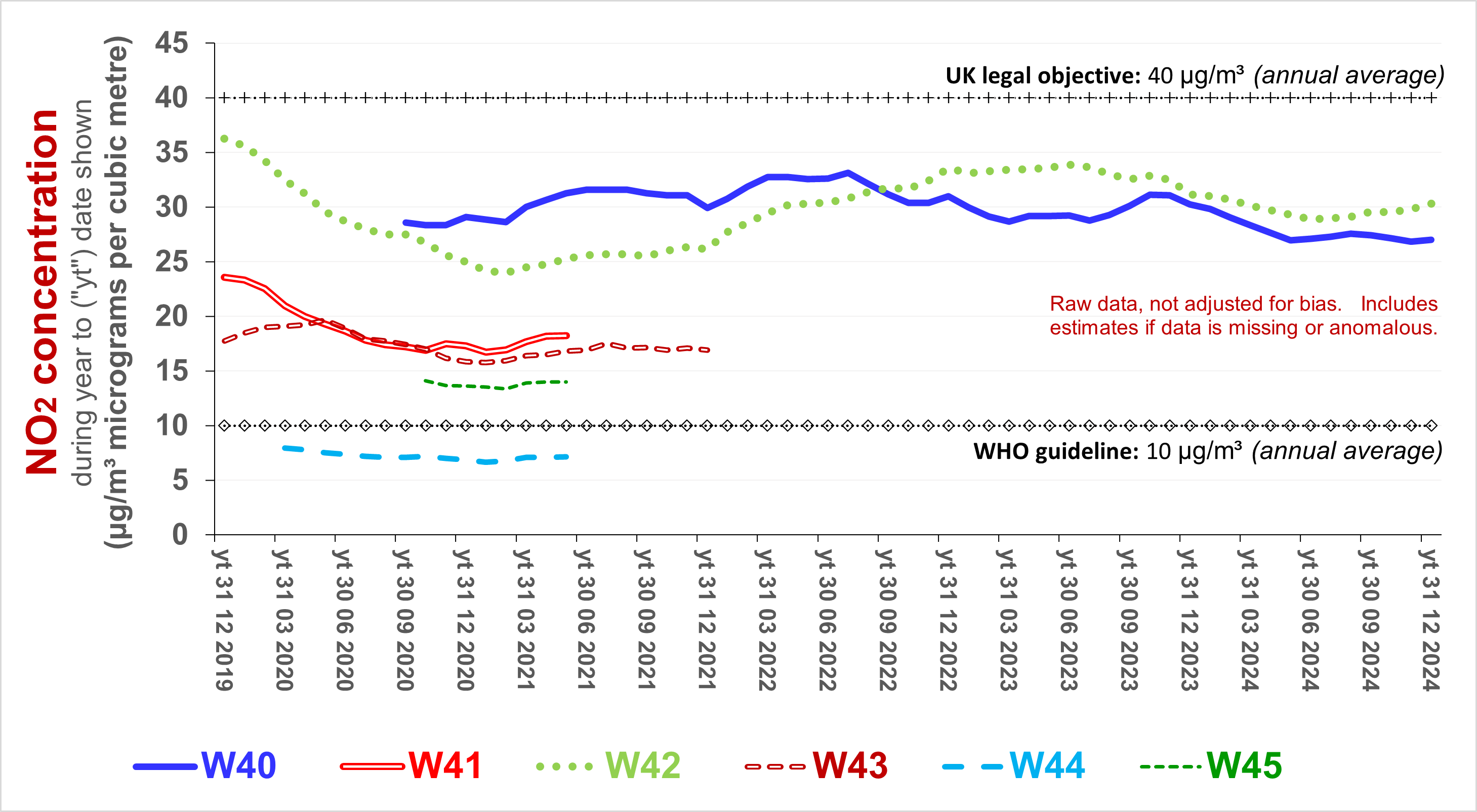 
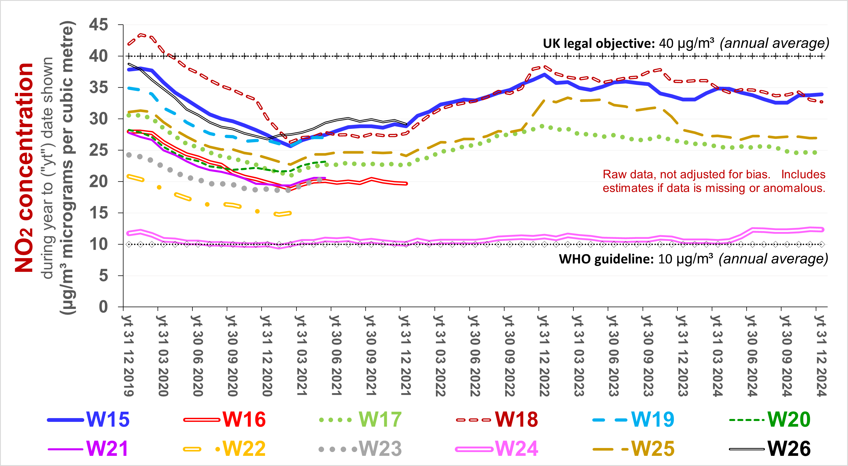 
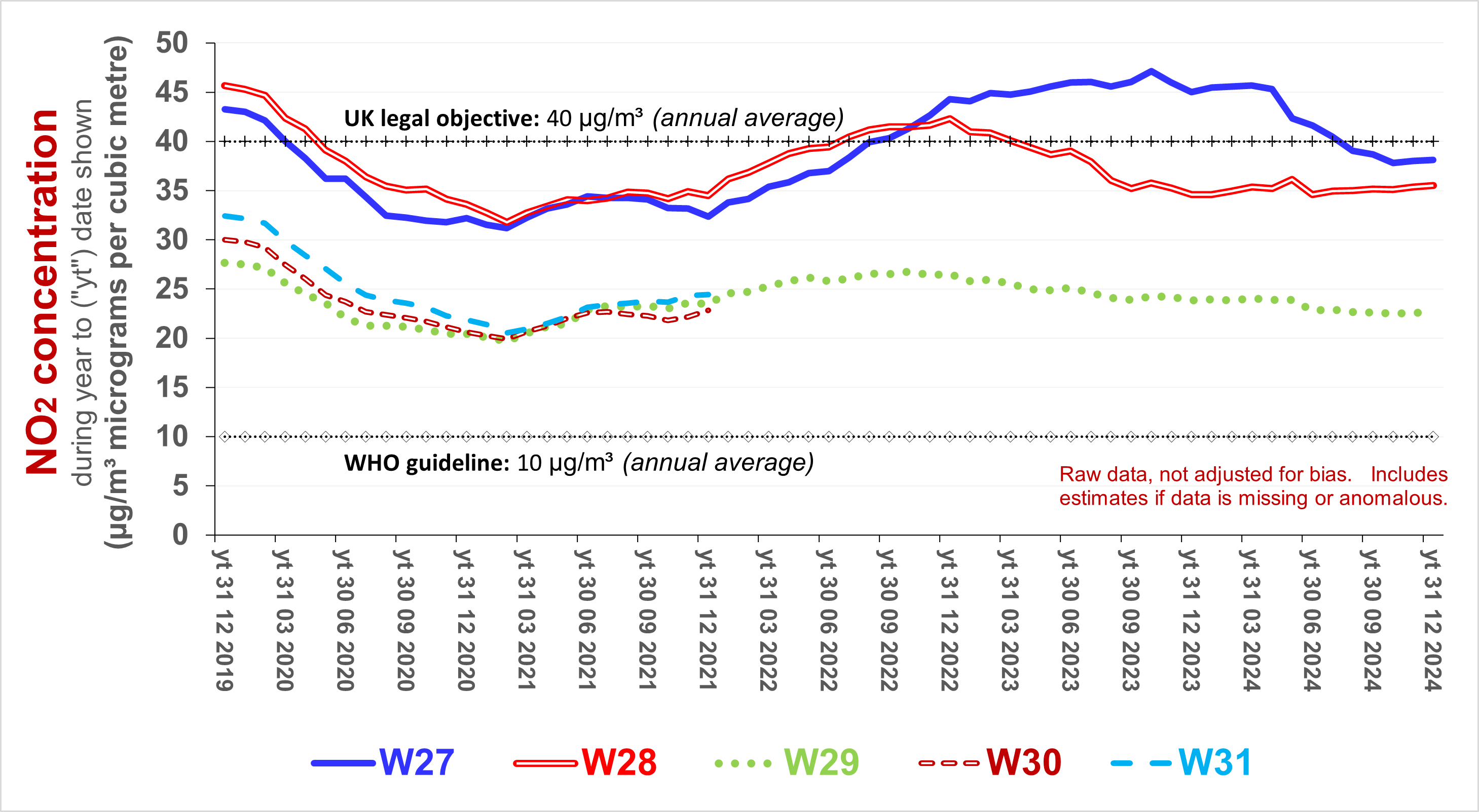 
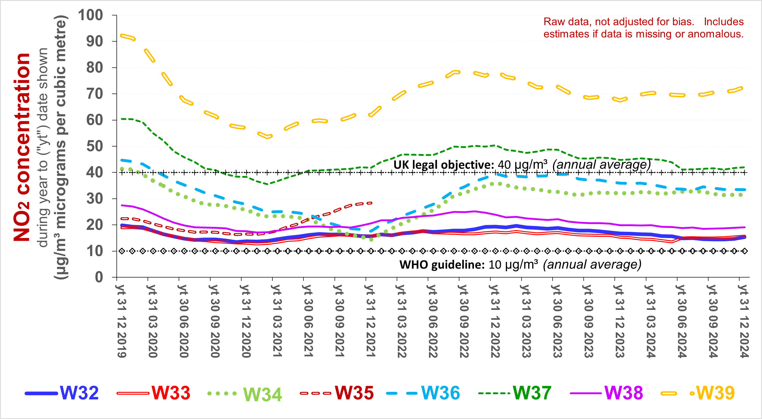 
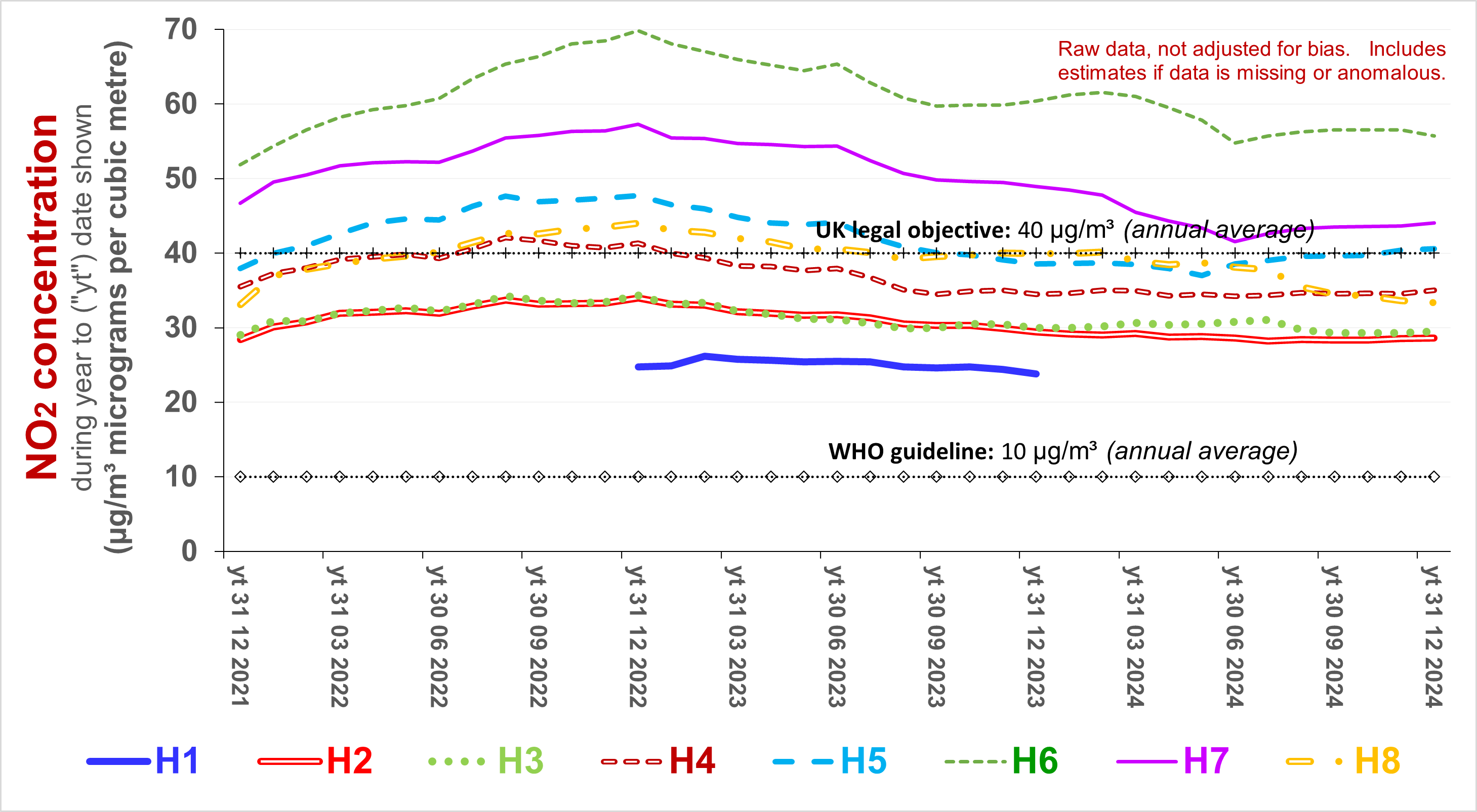  Source: based on Dorset Council and, prior to 2022, others
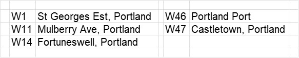
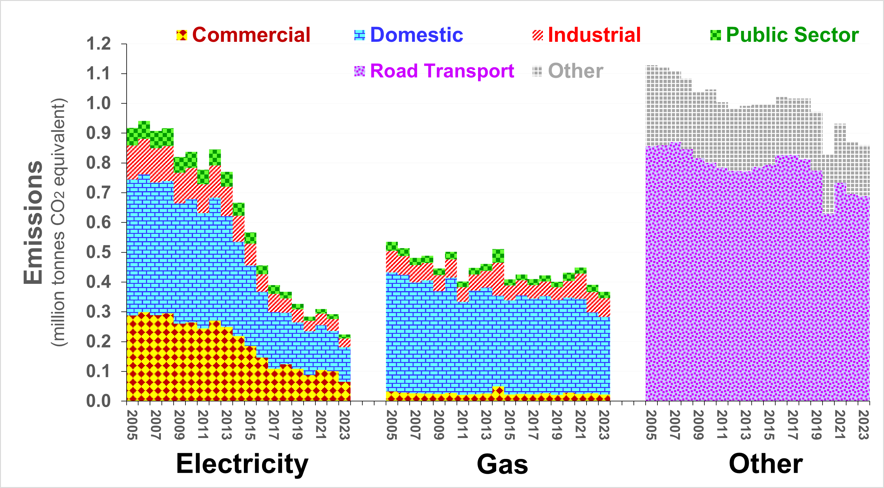
The following
two charts illustrate
DEFRA
estimates of Scope 1 and 2 greenhouse gas emissions. The
upper chart refers to Dorset - excluding Bournemouth, Christchurch
and Poole. The lower chart refers to Bournemouth, Chichester
and Poole. Road transport contributes substantially more to
the total shown on the upper chart. The rate at which
emissions from all sources has decreased sinced the UK declared a
Climate Emergency is roughly three times slower than imperative -
even to meet UK's 2050 target for Net Zero. The global
carbon budget for "1.5C" and probably "well below 2C" is not
negotiable and will have been exhausted before 2050. The
UK's share of this should be smaller than the average - in order
to reflect the UK's legacy of causing and promoting such emissions
- and the UK's wealth. |
|
For further information, please contact: info@airqualitymatters.uk |
| Back |