|
AIR QUALITY MATTERS |
|
Breathe London |
|
|
|
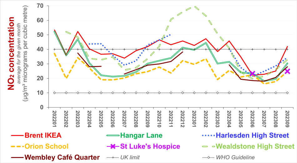
Data reported by lowish cost air quality monitoring devices indicate the concentration of specific pollutants. Reference monitors measure those concentrations, and the data they report should be regarded as provisional until it is explicitly ratified. Indicative data tends to be calibrated against measured data. As such it is presumably subject to amendment at the time measured data is ratified. Ratification tends be carried out with a time lag of three or six months, but this depends on who is contracted to do this. Ratified amounts might be very similar to provisional amounts, but differences exceeding 5% are not uncommon. (The adjustment which the UK's DEFRA requires local authorities to apply to concentrations measured using diffusion tubes tend to be greater.) The change depends in part on how ratification is carried out... Indicative data tends to be reported hourly. Intervals of one minute or less would be needed for traffic management and if one wishes to examine the impact of, for example, fireworks, diesel trains, refridgerated lorries, or the congestion and idling adjacent schools during the school day. The devices which are deployed under the Breathe London program report indicative data hourly - for nitrogen dioxide ("NO2") and particulat matter PM2.5. Breathe London adds significant, global value to that brand of devices. The usefuleness of indicative data depends on how it is presented. Communities and schools might not have the time or resources to transform the squiggly lines and hundreds of rows on spreadsheets which indicative devices tend to report. To best engage stakeholders, especially the public (in the case of schools, their staff, pupils and families), attempts to summarise the data should focus on trends - monthly (including, as successive 12-month averages if sufficient data is available), diurnal variation (subdivided by working week and weekends & public holidays), and - crucially - comparisons with other devices (plotted on maps and on graphs, to highlight difference in geography). Graphs and maps plotting data for periods shorter than 12 months should include notes which emphasise that the data is subject to seasonal variation. The following graphs may assist those interested in the data reported on Breathe London's website. The graphs derive from that data. North West London
The graph above suggests that, regardless of local geography, NO2 concentrations are tending to converge. This is unlikely, especially given similar convergence for PM2.5. Gaps in data (during winter months) may indicate that the given device relies on its solar panels for energy and that these did not receive sufficient sun light.
|
|
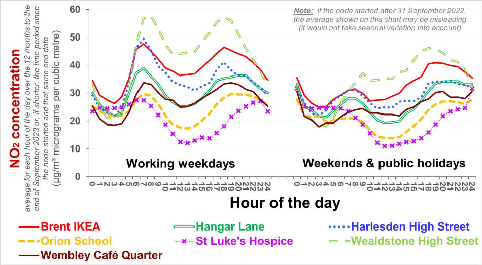
The chart above indicates that NO2 concentrations on working weekdays tend to exceed those on other days especially during the morning rush hour (presumably reflecting traffic flows) but not necessarily towards midnight (perhaps as a consequence of cooking, heating, etc.).
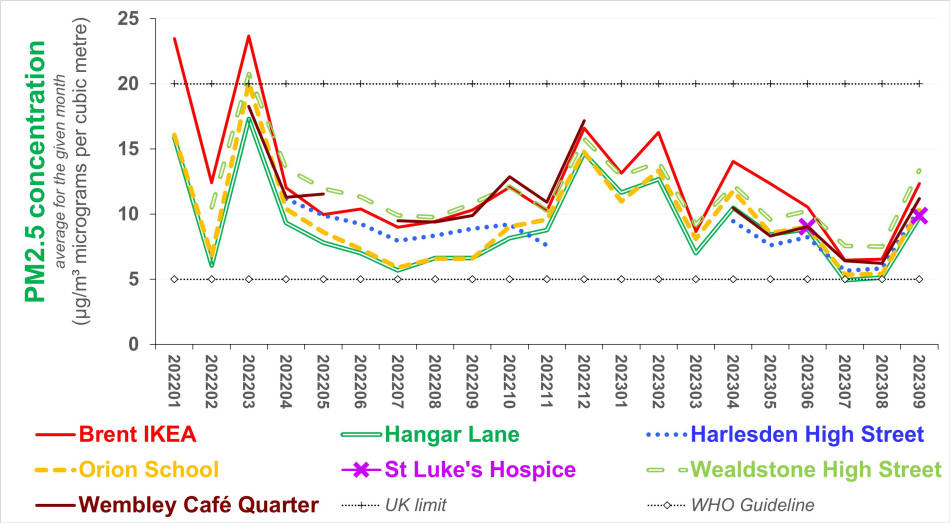
Comments: see the comments for trends in monthly concentrations of NO2 above
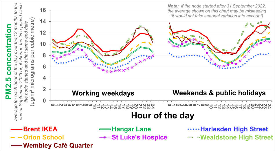
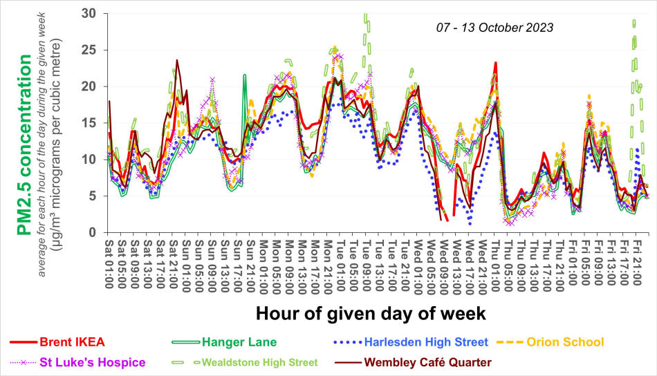
The graph above implies that the scale and pattern of PM2.5 concentrations on working weekdays are similar to what they are on other days. The lines shown for St Luke's Hospice are the least robust - they refer to only a few (summer) months of the year.
The graph above indicates that local sources of PM2.5 - and their absence - contribute little to fluctuations in PM2.5 concentrations across (this region of) London.
|
|
For further information, please contact: info@airqualitymatters.uk |
| Back |